5 Steps to Get the Best Corporate Brochure Design Dubai
Follow these 5 easy steps to get a professional and eye-catching corporate brochure design in Dubai. Improve the look of your company to draw in more customers.
If you want to market your products and services, brochures can be the most powerful weapon in your arsenal. But in a world where a mountain of marketing material is already vying for your readers’ attention, how do you make sure your brochure even gets picked up? Here, we have listed the 5 steps to designing a brochure that gets noticed.
Define your Message
First things first, before you determine a design for your brochure, it is crucial that you define a message for your brand. You should decide on what message you want your brochure to convey and the overall tone of the message before you work on the UI UX design elements. If you know who your audience is and what their pain points are, you can draft a strong, compelling message, fueled by powerful imagery, that resonates with them. For instance, let’s assume you are designing a brochure for your daycare center, aimed at new parents. Your message might be “A Fun Playful Haven” or “A warm and loving environment for your child.” In this case, it is best to leverage accessible, simple, friendly language, coupled with warm images of happy children and nurturing caregivers, to match your brand and appeal to your target audience.
On the other hand, if you are designing a brochure to advertise your insurance company, you wouldn’t want to use childish language and bright imagery. Knowing your audience, your message, and your marketing goals will help you make all the right design decisions.
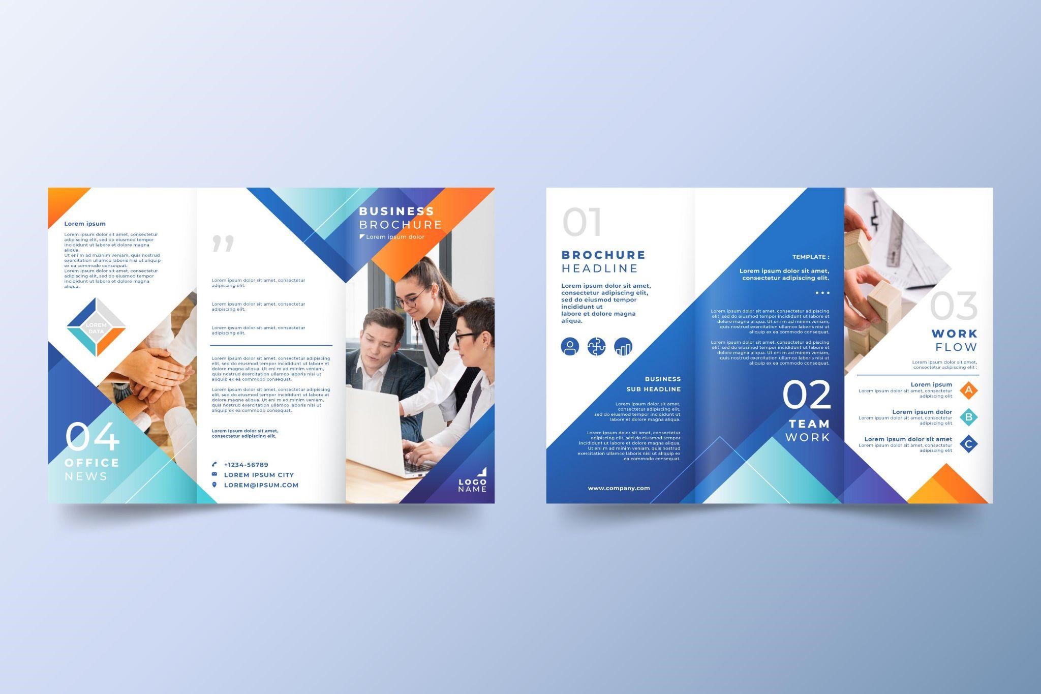
Choose Your Brochure Type
When you see a brochure, you see just a brochure. But to a designer, there are different layouts of brochures, depending on the way it is folded. Some of the most popular brochure types include Bi-fold, Tri-fold, Z-fold, parallel-fold, roll-fold, accordion fold, and single-gate fold. Your choice of brochure layout entirely boils down to your content. For instance, if you want to pack tons of information in your brochure, an accordion Fold will give you ample space to pack all the information and visuals.
On the other hand, if you are publishing a brochure for business or product marketing, a tri-fold would be more suited to your needs. Similarly, a four-panel parallel fold is perfect for promotional leaflets or event programs.
Add Compelling Copy and Striking Visuals
Great copy is the heart and soul of any brochure. This is why your brochure copy should be taken as a separate design element and not something that can be added as an afterthought. In fact, prepare your copy and images before getting down to the actual design part. Doing so alleviates the risk of overruns and delays affecting final costs and deadlines.
Decide on the ideal length of the copy. You may want to include tons of information in your brochure but remember that those huge text blocks can feel overwhelming and deter the readers from pursuing further. Instead, break down your text into skimmable and digestible portions with the help of headlines, sub-headers and bullets. Your headline should be the focal point and your chance to grab eyeballs.
The same goes with your visuals. Only use high-resolution, unique images that help you narrate your story and complement your copy. Your images are the first things people will see, so image placement also needs special consideration. Make sure your choice of visuals resonates with your audience and help them connect the dots.
Tip: Remember to keep it SIMPLE! Too much text, too many graphics, or too many different design elements can overwhelm the design and distract the user from the actual message.
Be mindful of Typography
Typography also plays a vital role in brochure design Dubai as it helps convey the message effectively, establish brand identity, and create visual interest. Make sure that the typeface you choose reflects your brand's personality and is easy to read.
It is also prudent to leverage typography to create a sense of hierarchy. For instance, the most important information should be the largest and most prominent, with lesser information taking a backseat. Most corporate brochures use serif fonts in the headline text, since they are bold, attractive and guide the eyes of the users towards the focal point, coupled with a sans-serif font in the body to visually balance the weight of the serif fonts.
However, again remember that when it comes to brochure design dubai, less is often more. Stick to a few fonts that look good together and limit the number of typefaces you use to avoid cluttering the brochure. While you may be attracted to out-of-the-box typography and decorative font styles, always make sure that form follows function in great design.
Incorporate a CTA
Ok, so you have an eye-flashing brochure, packed with tons of information. But what do you want your viewer to do with it? For instance, if you have advertised a product, you would ideally want customers to go to your website to place an order. Or if you are promoting your salon, you want your viewers to book an appointment.
The only way to spur readers into action is to make your “Call to Action” the focal point of your brochure. Don’t leave your CTA for the last page or bury it somewhere under mounds of text; instead, make it big, bold, and impossible for them to miss!

Subscribe & get all related Blog notification.


Post your comment