What Are Responsive Email Templates? 5 Essential Features They Need
 11 Mar 2025
 Reading Time : 6 Minutes
This article explains what responsive email templates are and highlights the five essential features they need. It covers the importance of creating emails that adapt to different screen sizes, ensuring readability and functionality on both desktop and mobile devices. Key elements include CSS media queries, flexible layouts, sizable interactive elements, larger text, and scalable images. The article emphasizes the benefits of responsive design, such as improved user experience, higher engagement, and better deliverability.

Which brings us to today’s lesson: What are responsive email templates, and what makes your HTML email templates responsive?
What Are Responsive Email Templates?
Responsive email templates are pre-built emails that adapt their design elements and layout for any desktop and mobile devices. Thanks to the responsive design, these email templates are not skewed or broken when viewed on different screen sizes—smartphones, tablets, laptops, and desktops. If the email marketing world has taught us anything, it's that beautiful emails on the desktop can transform into monsters on mobile and trust nothing.
That perfect header, the gorgeous layout, and the smartly placed CTA... all scattered as if the format vanished into the ether.
And you realize, boy, creating emails that render properly across devices isn’t a piece of cake. But it also hits you hard that your emails NEED to look and function their best on both desktop and mobile because 71.5% of consumers most often check their emails on a mobile device.
Unlike Dwayne ‘The Rock’ Johnson’s new Papatui hair-care line, which gets attention thanks to his star power, most emails don’t have celebrity endorsements—just the silent judgment of subscribers squinting at their phones. Emails must rely solely on their design, content, and responsiveness to engage users.
Hence, the responsive email templates.
Responsive email templates are coded in a way that varying device sizes do not affect their readability and functionality. Thus, using such email templates, you can create responsive and aesthetically appealing emails with zero coding skills.
Reliable services such as responsive and personalized email template design take much technical work off your table and hand code flawlessly responsive email templates.
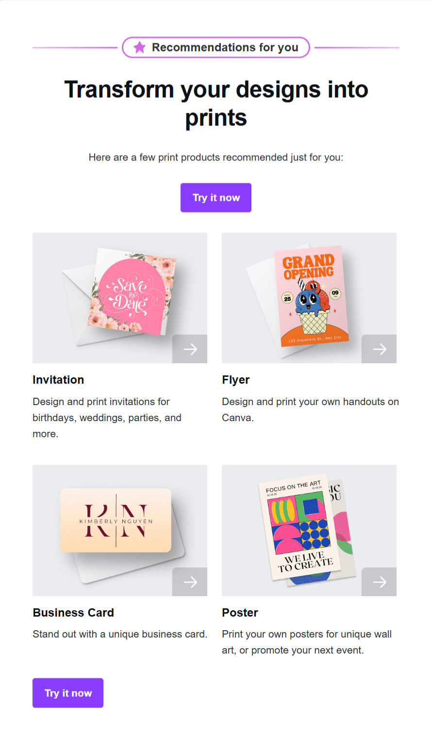
To create responsive email templates, you can source inspiration from many places, Canva being one of them. Canva does a fantastic job of creating a good responsive email design in this email:
Desktop View:
Mobile View:
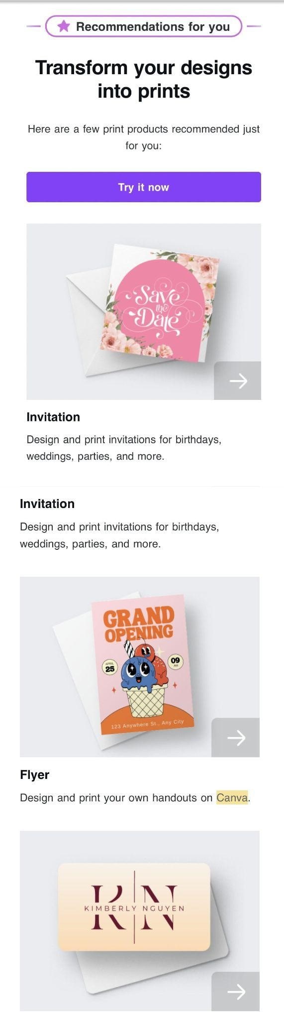
The desktop version of the Canva email uses a wider layout with multiple columns thanks to more horizontal space available on the desktop. Conversely, the mobile version fits the email content in a single-column layout to the smaller screen size.
Also, notice how the images display without distortion as they scale appropriately in the mobile view. Earlier, the elements sat side-by-side in the desktop version layout. But now, they are arranged vertically for better readability on smaller screens.
Overall, it is a good example of a responsive design that makes your email content easy to navigate regardless of how they access it.
So, why does creating responsive email templates matter?
Responsive HTML email templates are easy to read and engage with. Better readability and engagement reward you with better user experience and clicks. Plus,
-
Creating responsive email templates saves you a lot of time and effort. You do not have to be a coding expert, nor do you need to build emails from scratch.
-
Responsive email designs serve a favorable email viewing experience for every user. This improves your email deliverability. Meaning your emails are less likely to land in the spam folder.
-
Because your emails look great on any device, they reduce your subscribers’ efforts to read and take action. A great way to inspire higher engagement and conversions.
On the other hand, non-responsive email templates can mean annoyed readers. They have to pinch and zoom to read text. The fat-finger problem makes tapping tiny buttons a struggle. Such a frictionful user experience causes recipients to lose interest, potentially missing out on valuable information or offers.
Clear so far? Cool, now let’s learn more about the fundamental principles of creating responsive email templates.
Key Elements to Focus On While Creating Responsive Email Templates
A responsive email template becomes responsive due to the following elements:
1) CSS Media Queries
CSS media queries are how an email template adapts to be responsive. CSS is a rule-based email coding language used for styling HTML. CSS media queries are rules written in CSS used to dictate how an email appears on different devices.
Said another way: media queries are like instructions that tell the email, "Hey, if you're being viewed on a small screen, change the way you look!"
Media queries provide instructions within the email code for altering the design when users open emails through mobile devices. Using min-width and max-width. A media query serves to define both max-width and min-width attributes according to a specific device specification.
The application of max-width serves as the foundation to create designs for big screens first before adapting them for smaller screens. Write the CSS code for desktop email design within this section. This is your "default" style.
The media queries contain max-width parameters telling the system to modify particular styles when the display reaches or drops below a certain size point.
The CSS code that determines how an email appears on mobile devices should be written under the min-width condition. You can direct media queries through min-width to modify specified styles when screens achieve specific sizes for desktop.
2) Flexible Layouts
Responsive email templates use fluid or flexible layouts. This means their design adjusts to various screen sizes, using percentages rather than locking them in fixed pixel widths.
For instance, a flexible layout uses percentages instead of setting an image container to a fixed width of, say, 500 pixels (which would remain that size regardless of the screen). An email banner, for example, might be set to a width of 100%. This tells the email client to stretch the banner to fill the entire width of the screen, whatever that width may be.
This allows images and text blocks to scale relative to screen size. Otherwise, as it happens with fixed widths, the email client will follow that direction regardless of screen size. The result is inevitably poor user experience on smaller devices—truncated content or horizontal scrolling.
The benefit of this flexibility is that it prevents embarrassing issues such as awkward spacing, content overflow, tiny fonts, or content trimming when viewed on smaller screens.
3) Sizable Interactive Elements
To create responsive email templates, buttons and links must be click- and touch-friendly. On mobile, they should be larger and spaced neatly so people don’t accidentally tap on two options at once. The ideal tap targets (buttons) should be at least 44px x 44px, which matches the average adult's finger pad.
And please, resist the urge to add hover-based interactive elements. They look awesome on desktops, but on mobile devices, their functionality is questionable.
4) Larger text
The responsive email templates are going to be viewed on mobile devices. Thus, making the text easy to read is non-negotiable. The email text must scale up for better readability on smaller screens.The text of an email on mobile should be larger on smaller screens. The rule of thumb is to choose a font size of at least 16px for readability on mobile.
5) Scalable Images
Images in responsive email templates must be designed to resize proportionally with the layout. This means they maintain their quality and clarity, whether viewed on a large desktop monitor or a small mobile screen; it should not make a difference in quality and clarity.
Wrapping Up
Whether you create email templates by hand-coding or build on pre-built templates, they should be responsive. Your customers deserve the same experience of interacting with your emails, no matter what device they open them on.
Yes, creating responsive email templates is a geeky phase of email marketing. If wrestling with media queries and flexible layouts makes you also break into a cold sweat, we are not judging. Sometimes, the smartest move isn't learning to code responsive emails from scratch but partnering with specialists who live and breathe responsive email templates.

Subscribe & get all related Blog notification.


Post your comment